Features
This section provides an in-depth exploration of ViRelAy’s key features and capabilities. For those new to the application, we recommend starting with our Basic Usage tutorial, which offers a concise overview of the user interface and its fundamental components.
Projects
When starting ViRelAy, at lease one project file must be specified, which contains essential metadata about your project, such as its name, model, dataset, and references to relevant files. The project file format is detailed in the :doc:../contributors-guide/project-file-format article. A sample project file is provided below for reference:
project:
name: VGG16 ILSVRC2012-small SG
model: VGG16
label_map: datasets/ilsvrc2012/label-map-ilsvrc2012.json
dataset:
    name: ILSVRC2012-small
    type: hdf5
    path: datasets/ilsvrc2012/ilsvrc2012-small.input.h5
    input_width: 224
    input_height: 224
    down_sampling_method: none
    up_sampling_method: none
attributions:
    attribution_method: smoothgrad
    attribution_strategy: true_label
    sources:
    - ilsvrc2012-small-sg/attribution/ilsvrc2012-small.smoothgrad.h5
analyses:
    - analysis_method: spectral_analysis
    sources:
        - ilsvrc2012-small-sg/analysis/ilsvrc2012-small.smoothgrad.h5
ViRelAy allows you to load multiple project files simultaneously, which can be beneficial for comparing multiple similar classifiers. You can specify multiple project files as arguments when running ViRelAy using its command-line interface or the built-in HTTP server:
$ virelay '<project-file>' ['<project-file>' ...]
Alternatively, you can pass multiple project files to the run_wsgi_app function when running ViRelAy with Gunicorn, either by specifying them as arguments or by setting the VIRELAY_PROJECTS environment variable. The projects argument of the run_wsgi_app function takes precedent over the environment variable.
$ # Specifying multiple projects using the projects argument of the run_wsgi_app function
$ gunicorn \
    --workers 4 \
    --bind 127.0.0.1:8000 \
    "virelay.application:run_wsgi_app(projects=['path/to/project-1.yaml', 'path/to/project-2.yaml'])"

$ # Or using the VIRELAY_PROJECTS environment variable
$ export VIRELAY_PROJECTS="path/to/project-1.yaml:path/to/project-2.yaml"
$ gunicorn \
    --workers 4 \
    --bind 127.0.0.1:8000 \
    "virelay.application:run_wsgi_app()"
In the ViRelAy user interface, loaded projects are displayed as tabs at the top of the page, alongside the application logo. Clicking on a project tab navigates you to its respective page.
Clicking a project tab will navigate the user to the respective project’s page. The project selection can be seen in Figure 1.

Figure 1: The project selection in the ViRelAy UI.
The currently selected project’s name, dataset, and model are displayed in the footer of the ViRelAy UI within the project info pane (cf. Figure 2).

Figure 2: The project info pane in the ViRelAy UI, which shows some basic information about the currently selected project.
Analyses
An analysis represents the output of a quantitative analysis pipeline created with CoRelAy. These pipelines employ techniques, such as Spectral Relevance Analysis (SpRAy) [Lapuschkin et al., 2019], to generate visual embeddings and clusterings of attributions. Attributions are derived from dataset samples using the project’s classifier, often through tools like Zennit.
Each ViRelAy project can comprise multiple analyses, which can be accessed through the toolbox located at the top of the UI, below the project selection area (cf. Figure 3).
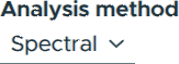
Figure 3: Selecting an analysis from the toolbox.
Clusterings & Embeddings
As stated above, an analysis comprises visual representations of attribution clusterings and embeddings. Each analysis can incorporate multiple embeddings, generated using various methods, as well as multiple clusterings, employing different techniques and parameters for each embedding. The resulting embeddings are categorized to facilitate efficient organization and exploration. A category usually corresponds to a class of the dataset, but it can also be used to multiple classes in multi-label classification scenarios or other concepts.
In the ViRelAy UI, category selection is performed through the toolbox at the top of the screen. Additionally, the toolbox enables users to select embedding methods and clustering techniques. The embedding viewer, situated at the center of the UI, displays embedding vectors from the current category using the selected embedding method and clustering technique. The embedding vectors are color-coded according to the selected clustering technique. The tools for navigating analyses can be seen in Figure 4.

Figure 4: Selecting categories, embeddings, and clusterings of the analysis in the toolbox.
When working with high-dimensional embeddings (i.e., more than two dimensions), users can customize the axes used for visualization. The toolbox provides a dimension selection interface, allowing users to choose which dimensions are displayed on the X and Y axes of the embedding viewer (cf. Figure 5).
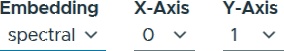
Figure 5: Selecting dimensions for high-dimensional embeddings.
Navigating Embeddings
The central component of the ViRelAy user interface is the embedding viewer, located in the center of the window. This interactive visualization displays the embedding vectors for the sample of the currently selected sample category using the chosen embedding method. The points are colored according to their cluster affiliation based on the currently selected clustering algorithm. Figure 6 illustrates an example of an embedding being visualized in the embedding viewer.
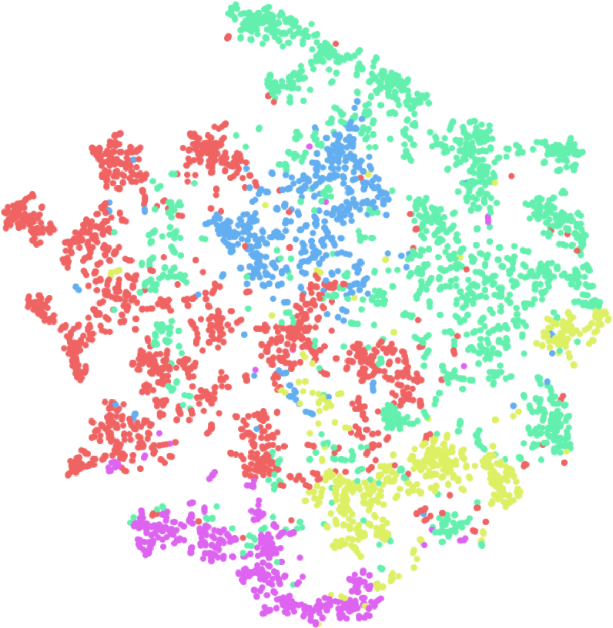
Figure 6: The embedding viewer in the ViRelAy UI, where the embedding vectors for the samples of the currently selected category are visualized using the selected embedding method.
The embedding viewer supports two primary modes of interaction:
Panning: Click and hold the right mouse button to initiate panning, then move the mouse pointer to navigate the visualization.
Zooming: Scroll the mouse wheel to zoom into or out of the region where the mouse pointer is currently positioned. Alternatively, click and hold the middle mouse button to start zooming, then move the mouse pointer up or down to adjust the zoom level.
When hovering over an embedding vector in the embedding viewer, a preview of the corresponding dataset sample (i.e., the input of the classifier) is displayed at the top left corner of the visualization. This can be seen in Figure 7.
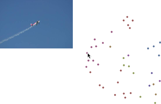
Figure 7: When hovering the mouse pointer over an embedding vector in the embedding viewer, a preview of the dataset sample is displayed in the upper left corner of the embedding viewer.
To select a subset of embedding vectors, click and hold the left mouse button and draw a selection rectangle over the desired points. To highlight the selected embedding vectors, they are displayed with an increased saturation. This process can be observed in Figure 8.
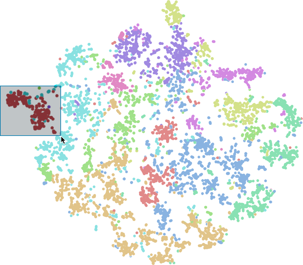
Figure 8: Embedding vectors can be selected in the embedding viewer by left-clicking and dragging the mouse pointer.
On the far right side of the user interface, several additional features are available:
Eigenvalue Plot: If the currently selected embedding method uses eigenvalue decomposition, this plot displays the eigenvalues in ascending order. Large changes between successive eigenvalues are referred to as eigengaps, which can be used to determine the optimal number of clusters. Hovering over the eigenvalues will display the number of clusters the eigenvalue corresponds to. An example of an eigenvalue plot can be seen in Figure 9.
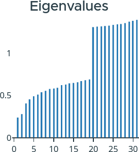
Figure 9: On the right side of the ViRelAy UI the eigenvalues for the currently selected embedding method are displayed.
Cluster Quick Selection: Below the eigenvalue plot, a list of all clusters for the currently selected clustering algorithm is displayed. By clicking on one of these buttons, you can quickly select all embedding vectors belonging to that cluster. Figure 10 illustrates shows the quick selection buttons for the clusters.
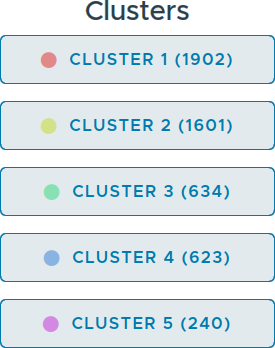
Figure 10: On the right side of the ViRelAy UI the quick selection buttons for the clusters of the currently selected clustering method are displayed.
Inputs, Attributions & Heatmaps
When embedding vectors are selected in the embedding viewer, the sample viewer at the bottom of the window provides an interactive visualization of the corresponding dataset samples. This viewer is optimized for performance by displaying only the first 20 samples. Below each sample image, the cluster affiliation is displayed.
To facilitate the analysis of misclassified samples, hovering over the image with the mouse pointer reveals the predicted label from the classifier. This information enables users to identify and inspect samples that were incorrectly classified. An example of samples being displayed in the sample viewer can be seen in Figure 11.
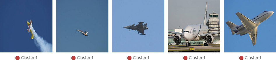
Figure 11: The samples for selected embedding vectors are displayed in the sample viewer at the bottom of the ViRelAy UI.
Depending on the currently selected visualization mode, the sample viewer visualizes the samples in a different way:
Input Mode: The dataset sample, i.e., the input image used by the classifier, is displayed. Attribution Mode, A heatmap illustrating the contribution of individual pixels towards the classification result, is displayed. Overlay Mode: A combination of input image and attribution is displayed, which superimposes the heatmap onto the dataset sample image.
The selection of visualization modes is facilitated through a button group in the toolbox (cf. Figure 12).

Figure 12: In the toolbox, the display mode for the samples in the sample viewer can be selected.
The overlay mode superimposes the heatmap onto the input image, thus enabling us to directly see the underlying image features, while the attribution mode only shows the heatmap in input space. When the attributions are fine and detailed it usually makes sense to directly view the heatmaps, as the image details can be seen in the heatmaps. When the attributions are coarse, it is harder to correlate the heatmap to the corresponding image regions, therefore, the overlay mode makes it easier to find the actual image features that were attributed. Figure 13 shows the same sample in all 3 modes.

Figure 13: A sample image visualized in all 3 display modes.
Heatmaps provide an intuitive representation of attribution values by highlighting pixels that positively or negatively contributed to the classification result. Positive attributions indicate regions that supported the predicted class, while negative attributions suggest areas that contradicted it.
The heatmaps are rendered using a selected color map, which can be chosen from a variety of options within the toolbox (cf. Figure 14). This allows users to customize their visualization according to their preferences and better interpret attribution values.

Figure 14: The color map that is used to render the heatmaps can be selected in the toolbox.
Depending on the size of the sample images and heatmaps, the sample viewer will either display the image smooth or pixelated. The smooth mode is used for larger images, while the pixelated mode is used for smaller images. This makes it easier for users to inspect samples and heatmaps without losing important details: when the sample images and heatmaps are small, smoothing the image could potentially smear out important details, while pixelating large images could potentially hide small details (cf. Figure 15).
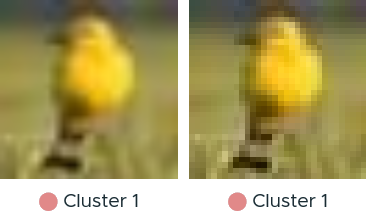
Figure 15: A sample image in both smooth and pixelation image sampling modes.
Although the sample viewer automatically selects the appropriate mode based on the size of the sample images and heatmaps, i.e., if the sample images or heatmaps are smaller than the image element on the screen, the pixelated mode is used, while the smooth mode is used for sample images and heatmaps that are larger than the image element, users can manually override this behavior by clicking the “Smooth” or “Pixelated” buttons in the toolbox. This allows for greater flexibility in visualizing samples and heatmaps according to user preferences (cf. Figure 16).

Figure 16: The buttons for switching between automatic, smooth, and pixelated image sampling modes in the toolbox.
Exporting, Importing & Sharing Results
ViRelAy provides several features for managing and sharing results, allowing users to export their findings for documentation, import saved states for reproducibility, and share their results with others.
Exporting Results
To capture your analysis progress or save specific findings for later reference, click the “Export” button in the toolbar (cd. Figure 17). This will generate a JSON file containing the current project configuration, including:
Current project
Selected Analysis
Category, embedding, and clustering settings
Color map configurations and ample viewer display mode
Currently displayed samples and selected embedding vectors

Figure 17: The toolbar contains 3 buttons for importing, exporting, and sharing findings.
Importing Saved States
This JSON file can be imported later using the “Import” button or used independently for further evaluation, plotting, or sharing. To restore a previously exported state, click the Import button in the toolbar. ViRelAy will load the saved configuration, restoring the exact same settings and selected embedding vectors that were present when the export was created (cf. Figure 17).
Sharing Results with Others
For collaborative work or knowledge transfer, users can share their findings by clicking the “Share” button in the toolbar. This will generate a unique link containing the current project configuration, which can be copied and shared with others.
When the recipient opens this sharable link, ViRelAy will restore the exact same state that was present when the link was generated (cf. Figure 18). This ensures seamless collaboration and knowledge transfer between team members or stakeholders.
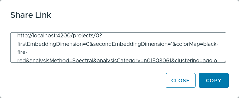
Figure 18: Clicking the “Share” button in the toolbar generates a sharable link, which can be copied from the share link dialog.